Top-down pixel art interiors: layout rules for 32px rooms
Nine layout rules we use for 32px top-down shops and hospitals: cut-away walls, height bands on the wall, work facing the camera, two-tile aisles, marked queues and a calm floor.
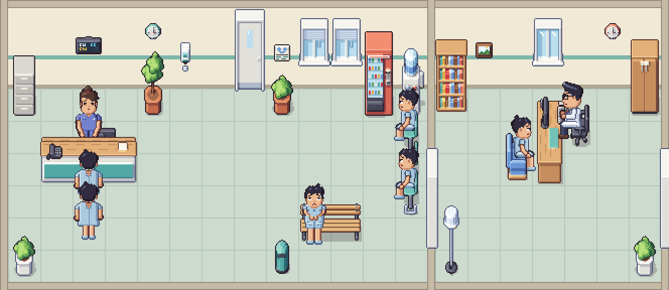
At 32px a person is not quite two tiles tall and a chair fits on one. There is no room for detail to explain anything, so the layout has to: who is waiting, who is working, where the next customer will walk. A good top-down interior can be read in one glance with no interface at all. A crowded one turns into a carpet of pixels as soon as five characters move through it.
These are the rules we follow when we lay out the scenes for our hospital, cafe and convenience store packs. Every room in those packs is built to them, so the pieces you buy already fit the rules.
1. Cut the walls away, and keep only one face
A top-down 3/4 room shows the floor from above and the walls at an angle. If every wall stands at full height, the side and front walls hide a third of the floor. The usual answer is a cut-away room:
- the back wall shows its full face, because that is where clocks, boards and shelves hang;
- the side walls show only their top edge, a thin strip seen from above;
- the front wall is just a low rim along the bottom, so nothing hides the floor next to it.
In our packs the wall stands on an 8 px wall line, the face is 80 px tall and the cap is 8 px. Those numbers matter less than the rule: one tall wall per room, at the back, and everything else low.
2. Treat the back wall as a notice board with height bands
The back wall face is the only vertical surface the player sees, so it becomes your in-world information panel. Divide it into bands and keep each kind of item in its band:
- Top band: things that run along the whole wall, such as lights, garlands and signs above a door.
- Middle band: menu boards, clocks, posters, screens. One item per wall tile, never two on the same tile.
- Bottom band: mostly empty, because furniture against the wall covers it.
Doors break the wall, so keep the tile on either side of a door free of large items. A board squeezed against a door frame reads as part of the door.
3. Face the work towards the camera
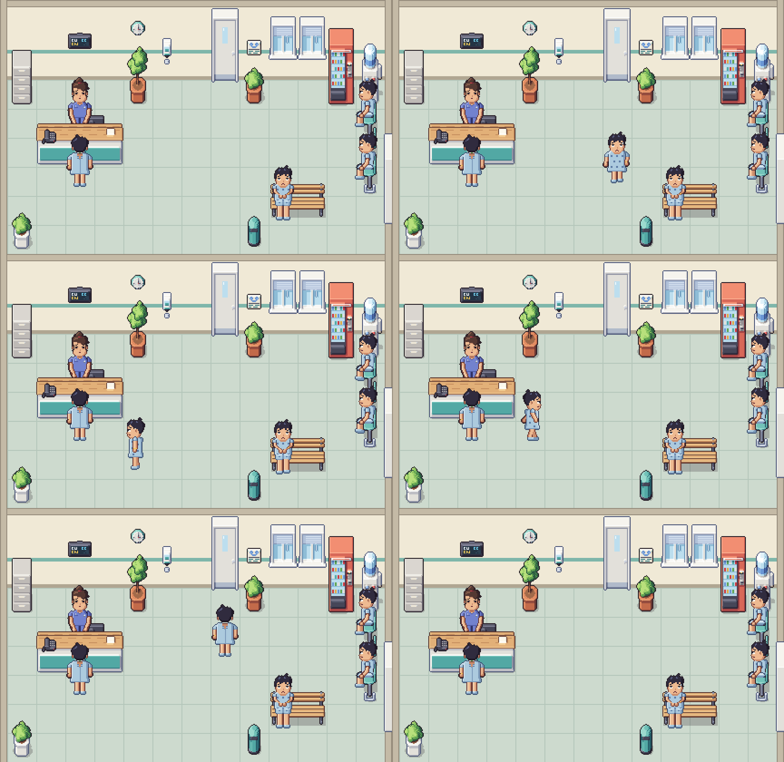
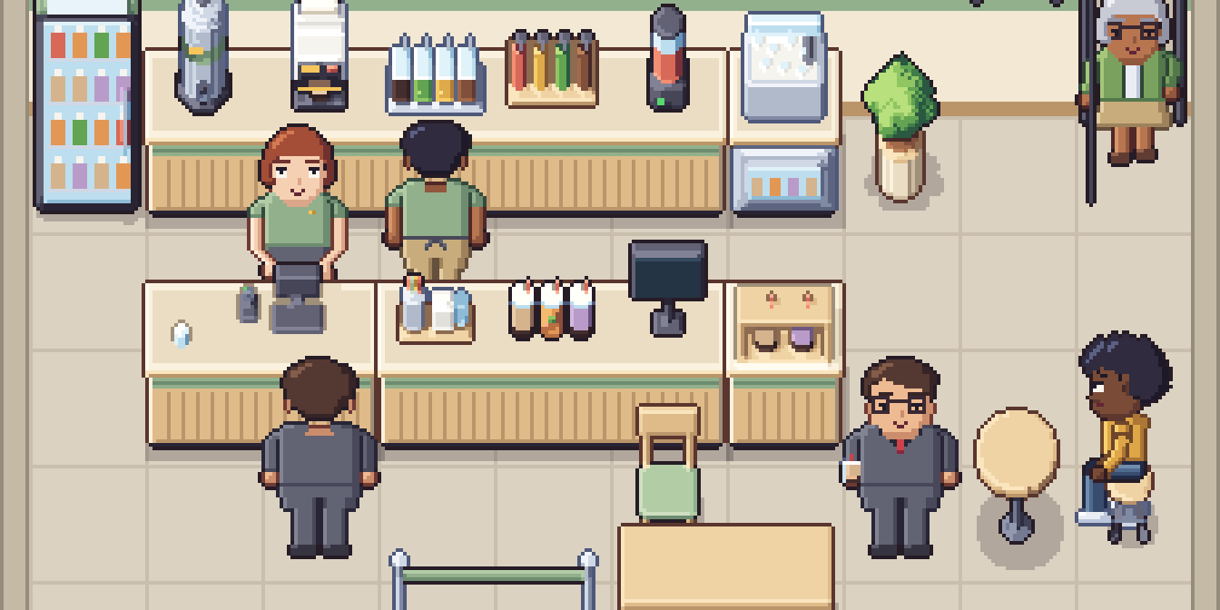
Anything the player needs to watch should face south, towards the camera. Staff stand behind counters and desks with their faces visible; customers stand in front with their backs to the player. Shelves show their goods on the south side. A cashier seen from behind, or a shelf seen end-on, hides exactly the information the player came to see.
This also decides which way aisles run. Shelves seen from the east or west show only their ends, so in a store the aisles should run east to west, with the goods facing the camera. Use an end display at the end of a run if you want goods visible there too.
4. Leave two tiles between tall rows
Tall furniture hides the floor behind it. Our store's gondola shelves are 51 px tall, more than a tile and a half. With only one tile between two facing rows, the northern row covers the lower shelves of the southern one and the people standing between them. Two tiles keeps both visible.
The general rule: the gap behind a tall object should be at least its height in tiles, rounded up. Low furniture such as tables and benches needs no extra room.
5. One room, one job
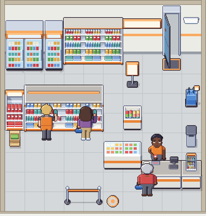
A hospital, an office or a big shop reads best as a set of small rooms, each with one purpose: reception, consulting room, ward, storeroom. Each room gets its own few objects, and the same object always means the same thing. If the only desk with a computer is in the consulting room, players learn to find the doctor by looking for the desk.
Inside a room, put the main object where the eye lands first: the reception desk near the door, the bed against the back wall, the checkout on the way out.
6. Mark every queue and every path
Lines of people are the main drama in a management game, so make them obvious. Point queues at the thing they are waiting for, mark them with a barrier, a divider or floor markers, and keep them out of the main walkway. Waiting seats belong along a wall, not in the middle of the floor. When the player can see where the queue starts and ends, they can judge how long it is without a number.
For a worked example of the whole route a customer takes, from the door to the till to the pickup counter, see our post on the order-to-pickup flow in a cafe game.
7. Keep the floor calm
The floor is the largest surface on screen, so it should be the quietest. Use one floor tile per room, and a quiet one: the floor tiles in our packs keep their joint lines only slightly darker than the tile, so characters and furniture carry the contrast. Save floor detail for meaning: a rug that marks a seating area, a mat at the door, a puddle or a spill that a cleaner has to deal with. Our hospital pack has flat decals for exactly that kind of job: drains, puddles, spills and litter.
8. Leave empty tiles on purpose
Empty floor is not wasted floor. It is where characters stand out. Keep at least one free tile in front of every seat, counter and door, so the person using it is not overlapped by the next object. Fill corners with plants or bins, not with things people need to reach. If a room feels empty, add a second character before you add a fifth object.
9. Build every room from one series
Nothing breaks a room faster than one object that does not belong: a piece from a different camera angle, a different pixel size or a different light direction stands out at once, and no layout rule can hide it. The simplest fix is not to mix at all. Build every room from one series of art, so every piece already agrees.
That is how our packs are made to work together. The hospital, bubble tea shop and convenience store share:
- one grid and one camera: 32px floor tiles, top-down 3/4, the same four directions;
- one pixel size: everything at 1×, to be scaled by whole numbers;
- one light: the same light direction and shadow style on every sprite;
- one outline and detail level, so a chair from one pack sits naturally next to a counter from another.
The Christmas add-on follows the same rules, so its decorations drop into any of the three. When a room needs something none of them has, leave the tile empty: an empty tile looks better than an object from another game.
Checklist
- One tall wall per room, at the back; side and front walls as low edges.
- Wall items in bands, one per wall tile, with space beside doors.
- Staff, shelves and anything to watch facing the camera.
- Aisles east to west, two tiles between tall rows.
- One job per room, main object where the eye lands first.
- Queues pointed, marked and out of the walkway.
- A quiet floor, with decals only where they mean something.
- A free tile in front of every seat, counter and door.
- Every room built from one series of art.
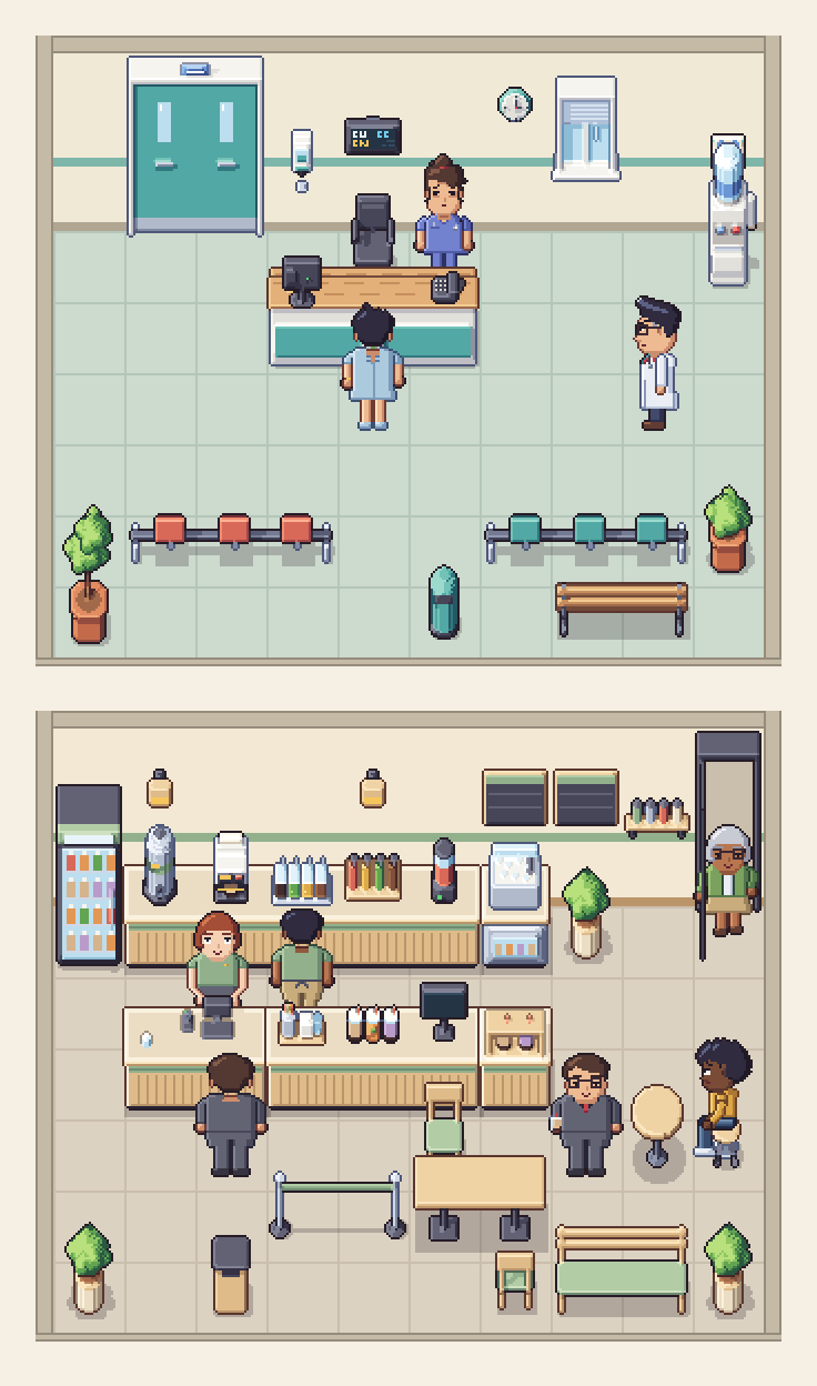
The rooms in this post come from our Modern Hospital, Modern Convenience Store and Modern Bubble Tea Shop packs, which we draw on one grid, with one camera and one light direction. For how characters sit in that furniture without sorting glitches, see Y-sorting with chairs and counters.
More from the blog
Vibe coding a game? Spend your tokens on code, not art
The code is the quick part now. Here is what the art for one small shop game really adds up to, and why a finished $1.99 pack beats spending your tokens on it.
Read the post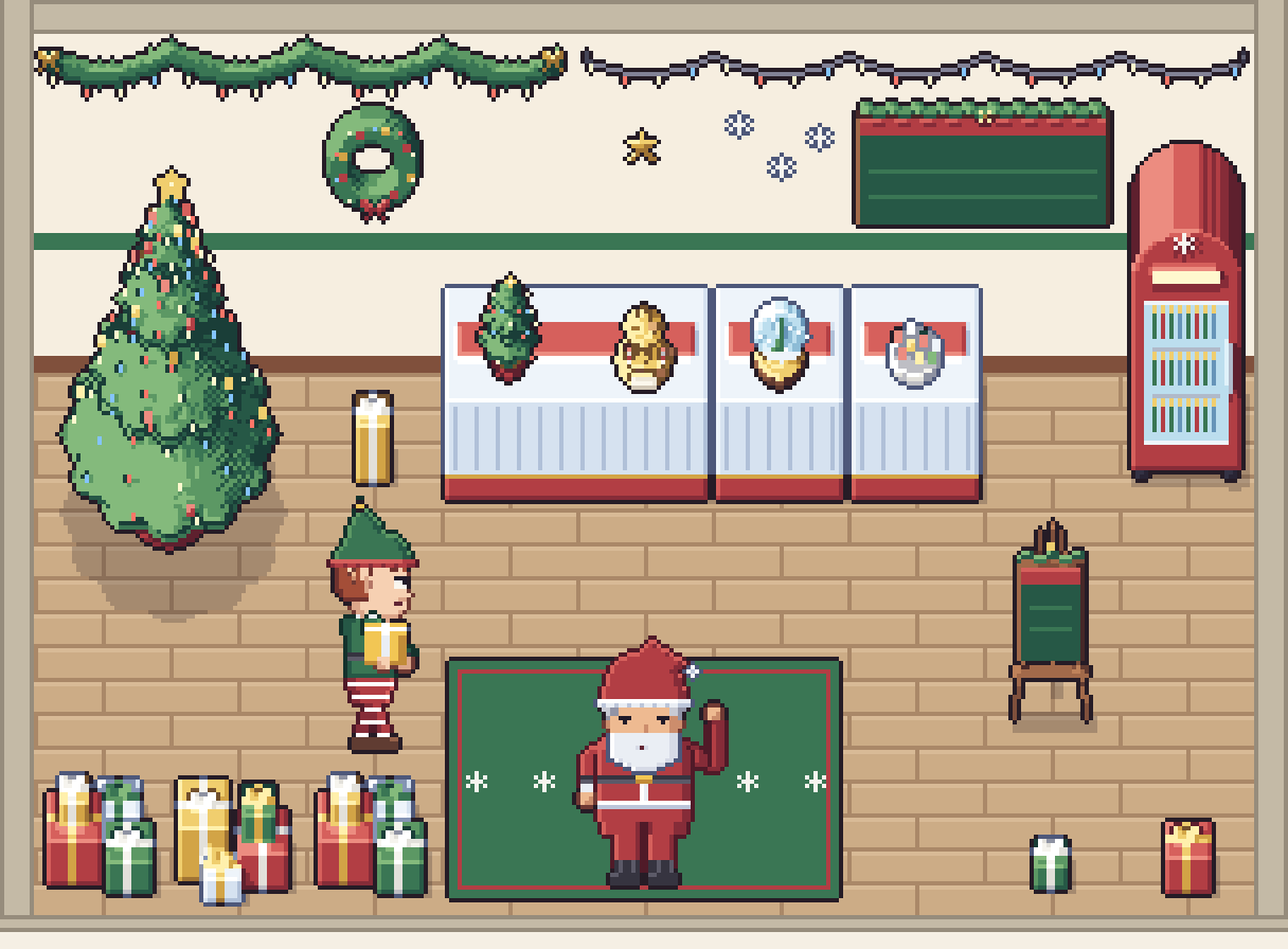
Christmas event ideas for tycoon and shop games
A practical plan for a Christmas event in a tycoon or shop game: pick a size you can ship, add mechanics that reuse your loop, and keep a decorated 32px room easy to read.
Read the post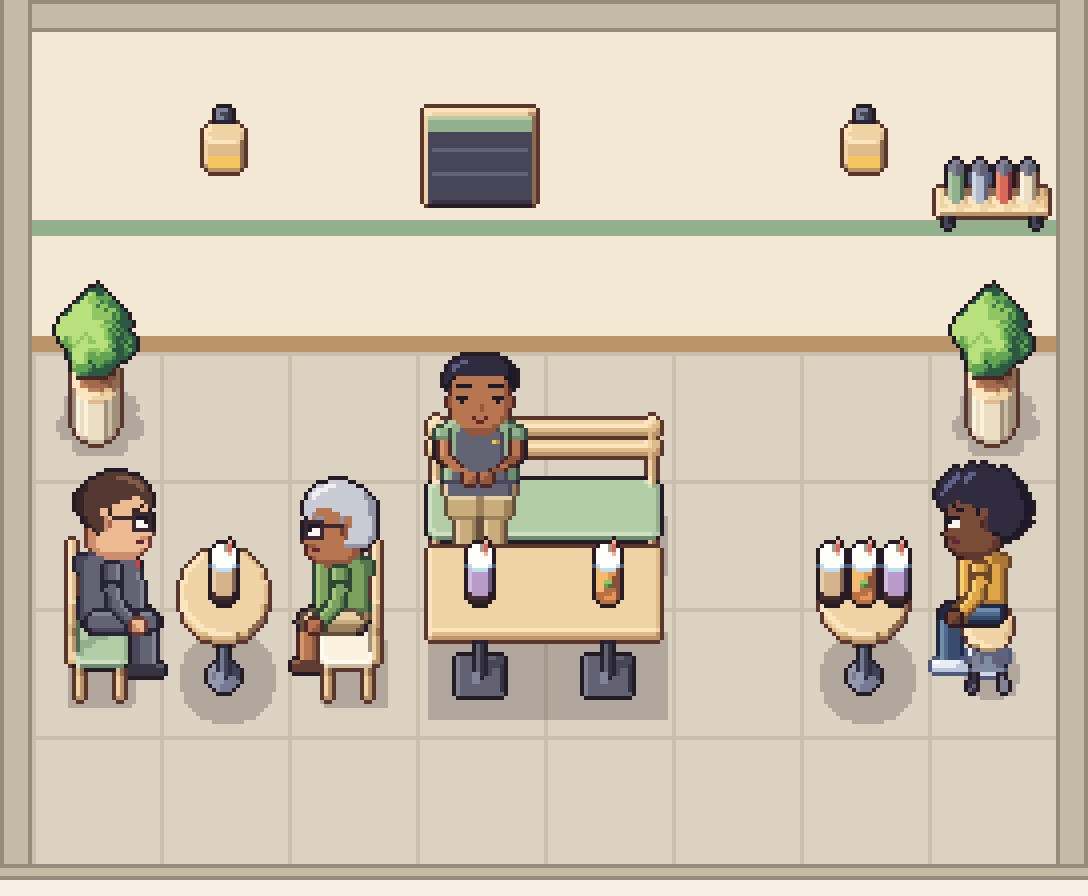
Y-sorting in top-down games: chairs, counters and overlays
Y-sorting handles walking past furniture, but not sitting in it. Where to put the sort point, why seats break the rule, and the front-overlay draw order that works in every direction.
Read the post